Zenyum is on a quest to spread happiness in Asia with its advanced oral care offerings. Marrying personalized services with the latest technology, the company is set on transforming the oral care industry with its innovative products and experiences.
The Challenge
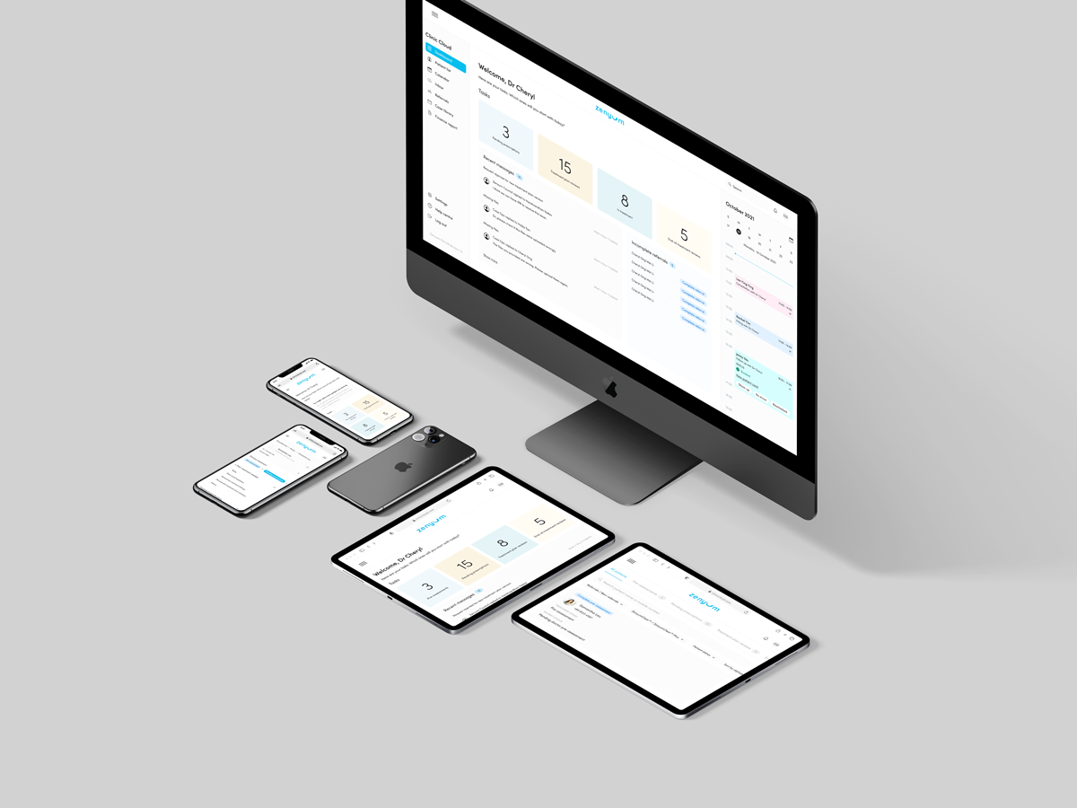
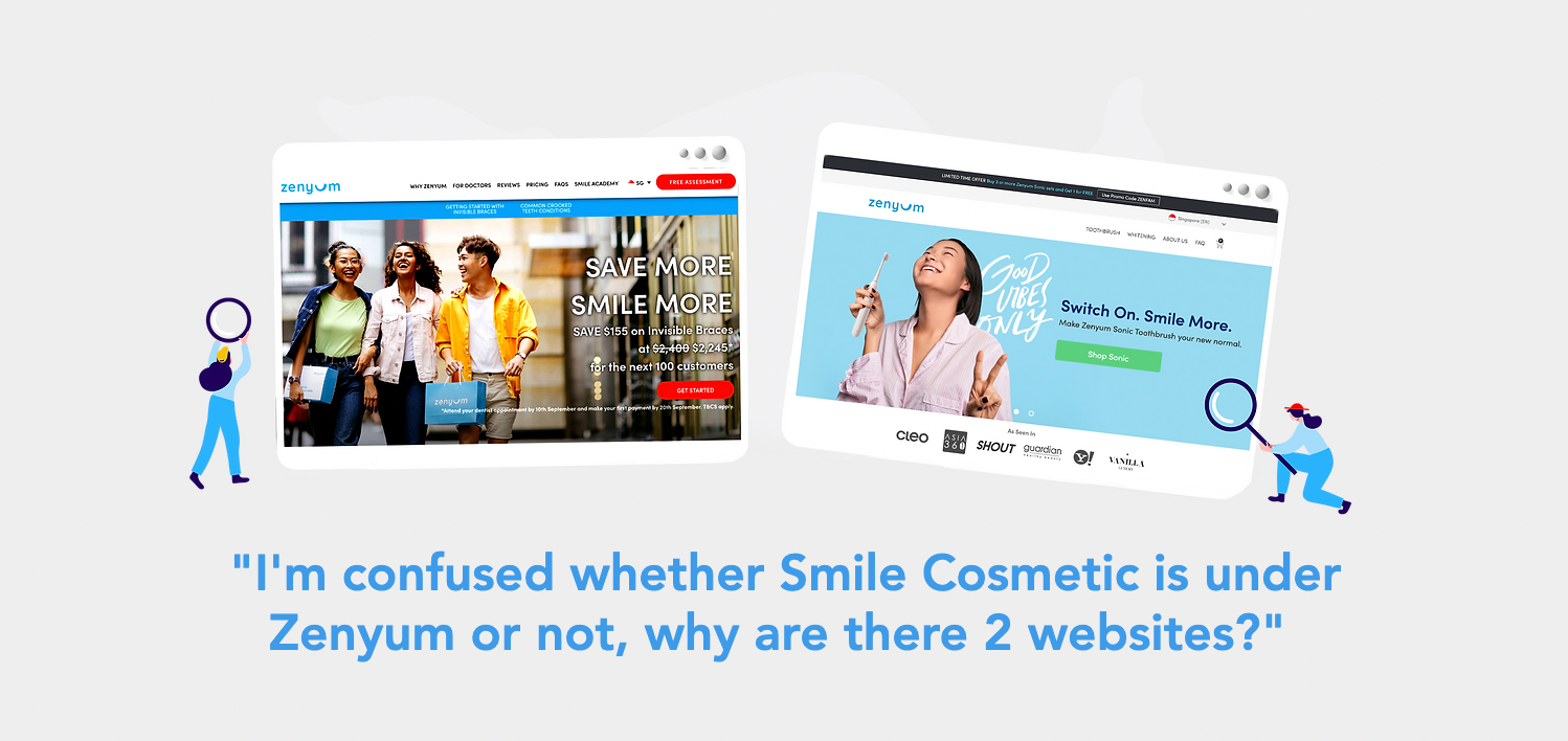
Zenyum faces the task of unifying its distinct product sites—oral care and invisible braces—into one seamless, user-friendly website. This integration aims to streamline the customer journey, eliminating the need to switch between different sites and styles, and will introduce e-commerce capabilities, allowing for direct purchases. The goal is to simplify and enhance the overall experience, making it more cohesive and less confusing for users.
Legacy version 1.0
3-Phase Approach
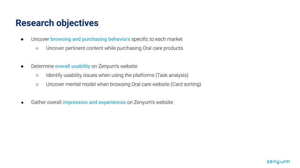
In our three-phase approach, the Discovery phase involved interviews with stakeholders from key departments to understand business challenges and competitor landscapes. Rapid user interviews pinpointed pain points and brand perceptions, leading to the creation of personas and detailed user journey maps for stakeholder clarity. Additionally, we explored shifts in consumer behavior outside our category to adjust our strategies in meeting evolving shopper expectations in brand engagement.
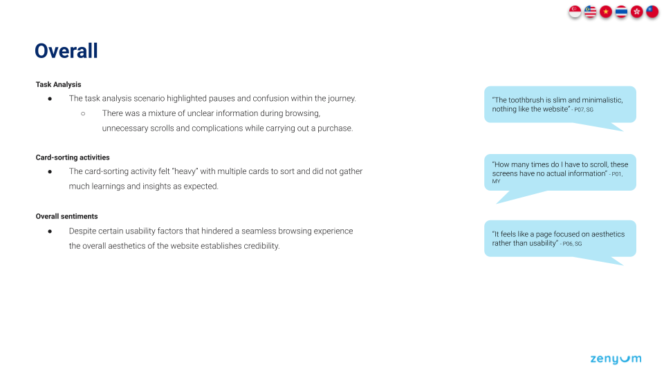
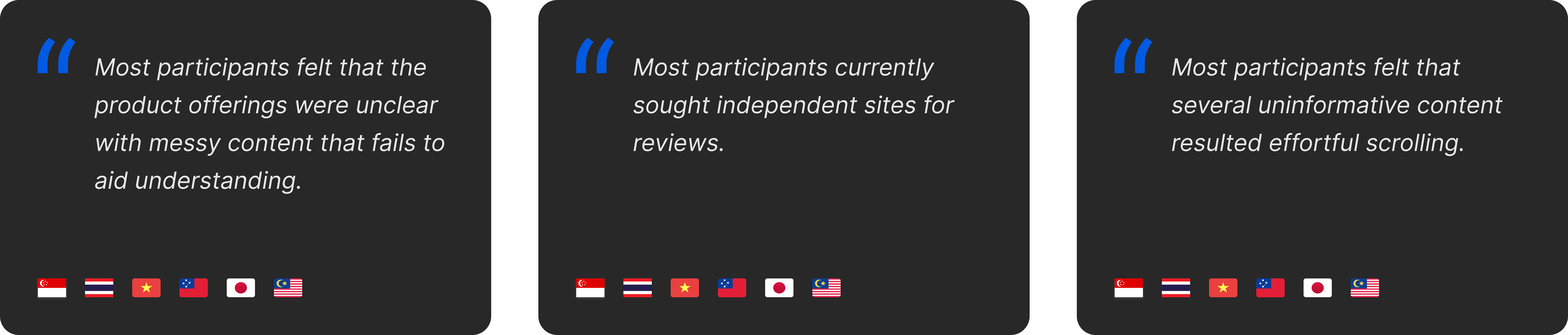
User Study
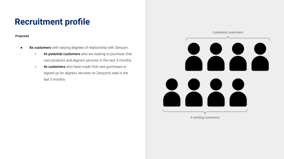
The team researched seven different markets and conducted on-site interviews with Zenyum dentists to gather insights into how local audiences interact with brands they love. Our goal was to understand current user expectations for brand interactions.
3 Key Insights


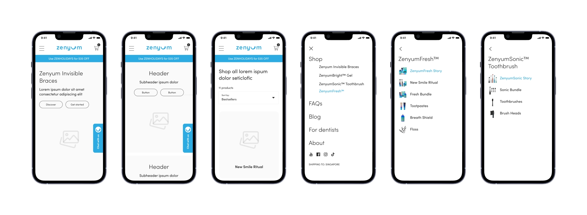
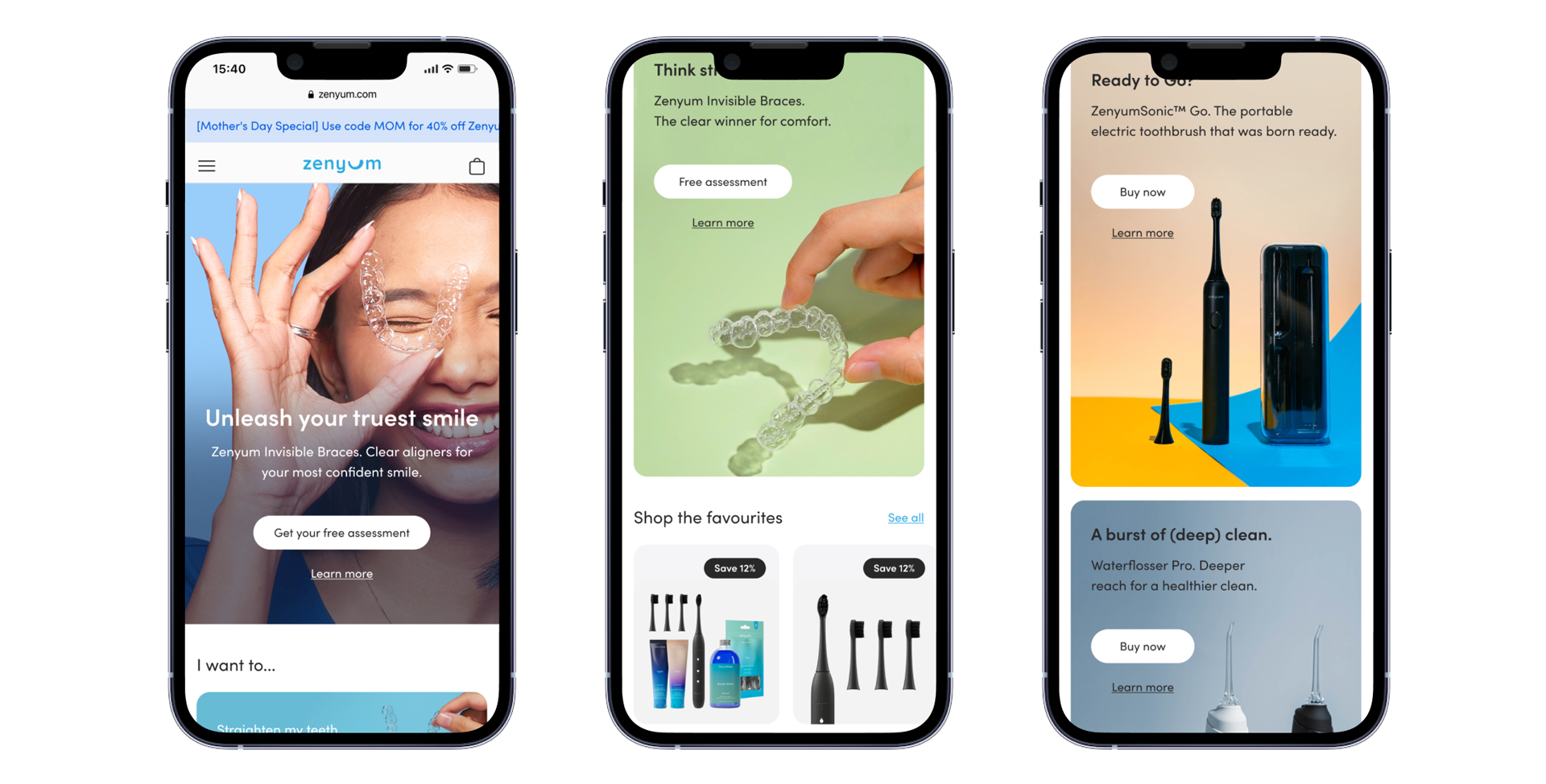
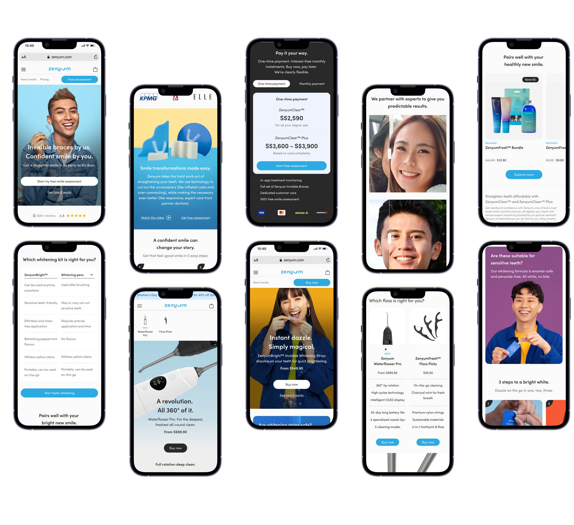
Restructuring User flow

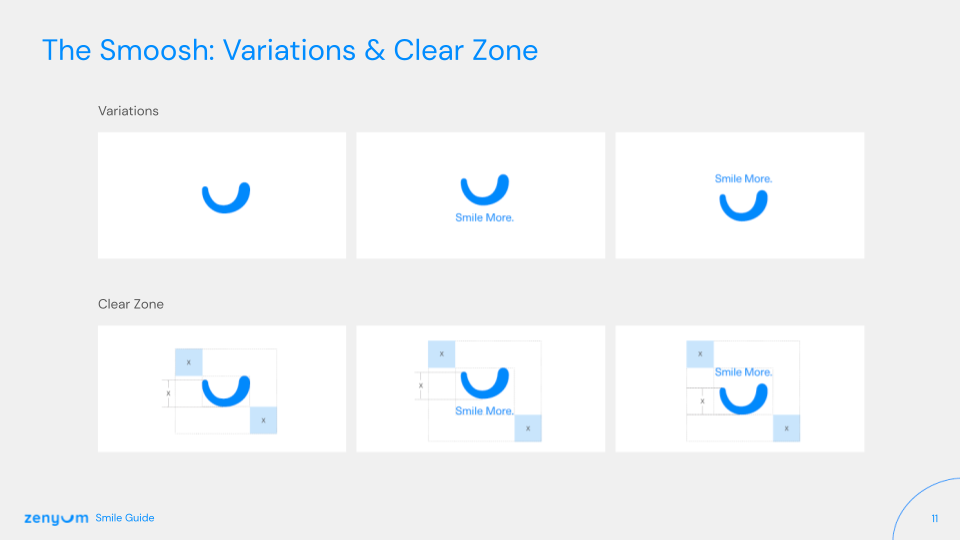
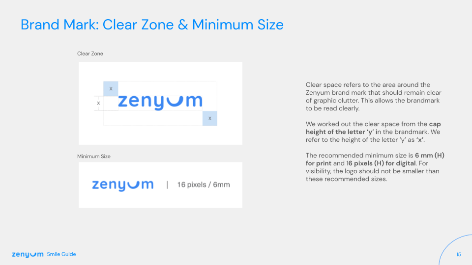
Refreshing Style Guide
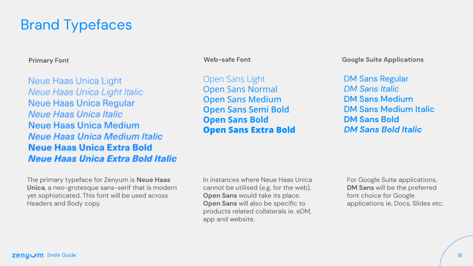
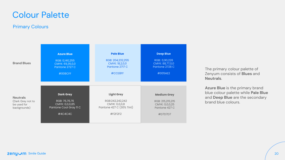
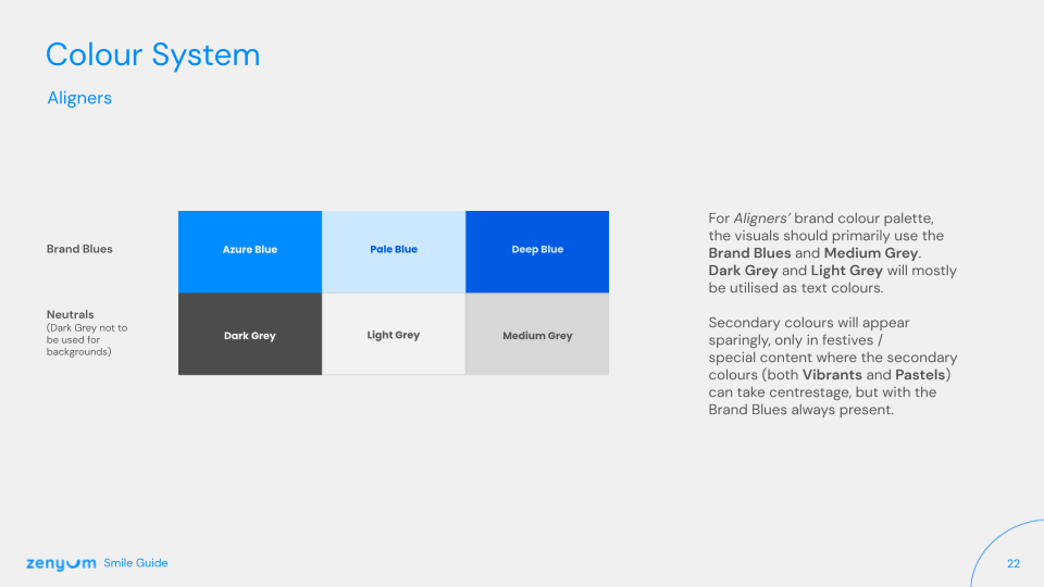
The design of the Zenyum website had remained unchanged since its initial launch, leading to the need for a redesign. A new design system was established, building on top of Carbon Design System components and universal interaction patterns, to effectively convey the company's attention to detail and enhance the user experience.

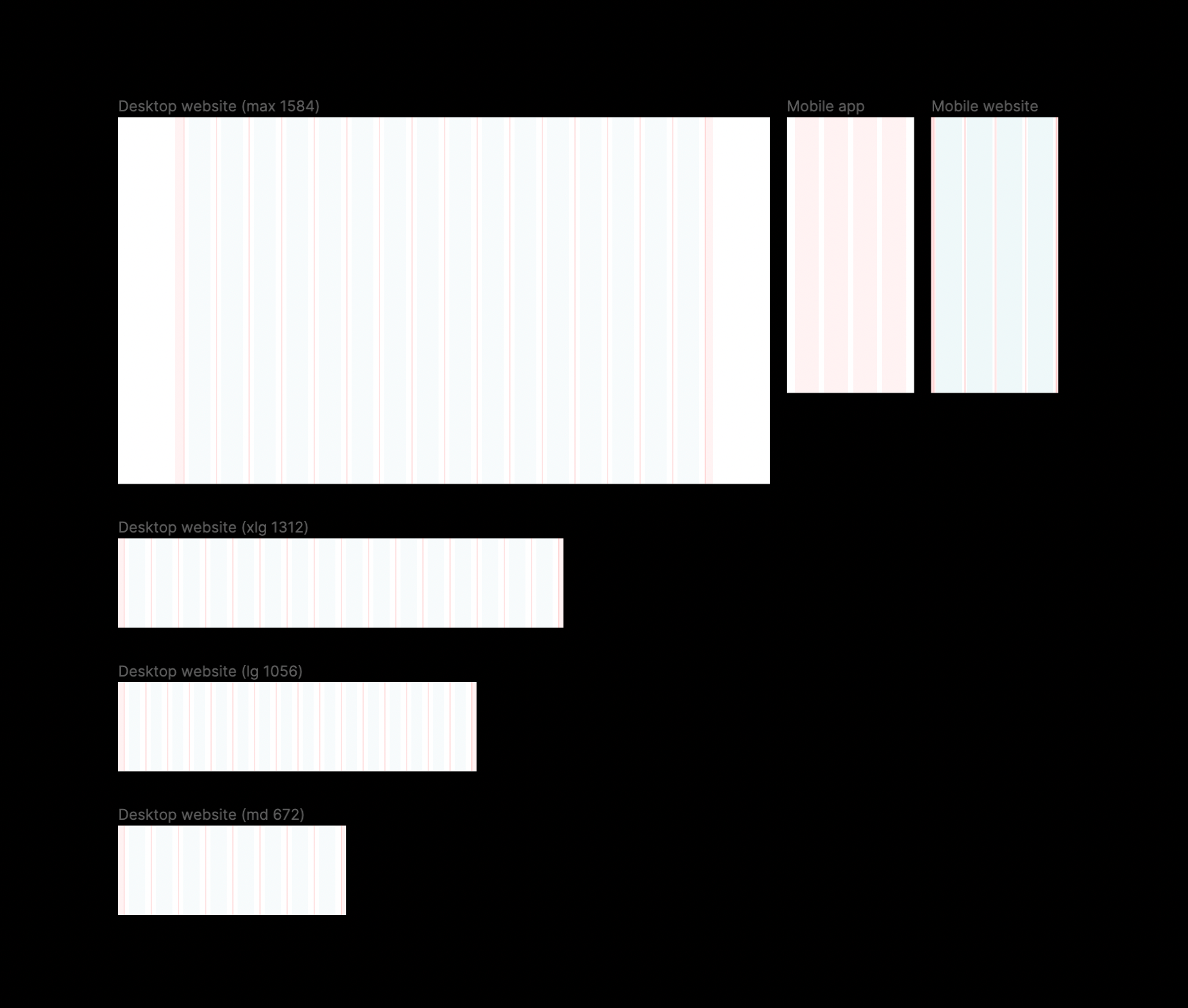
Set up Grid Fundamentals
The new application of the basic unit of 2x Grid geometry is the 8-pixel square mini-unit. Multiples of mini units compose the dimensions of columns, rows, and boxes, along with their margins and padding. The mini-unit adapts to our content while maintaining a consistent visual rhythm.
Prototyping & Testing
Defining the Epics
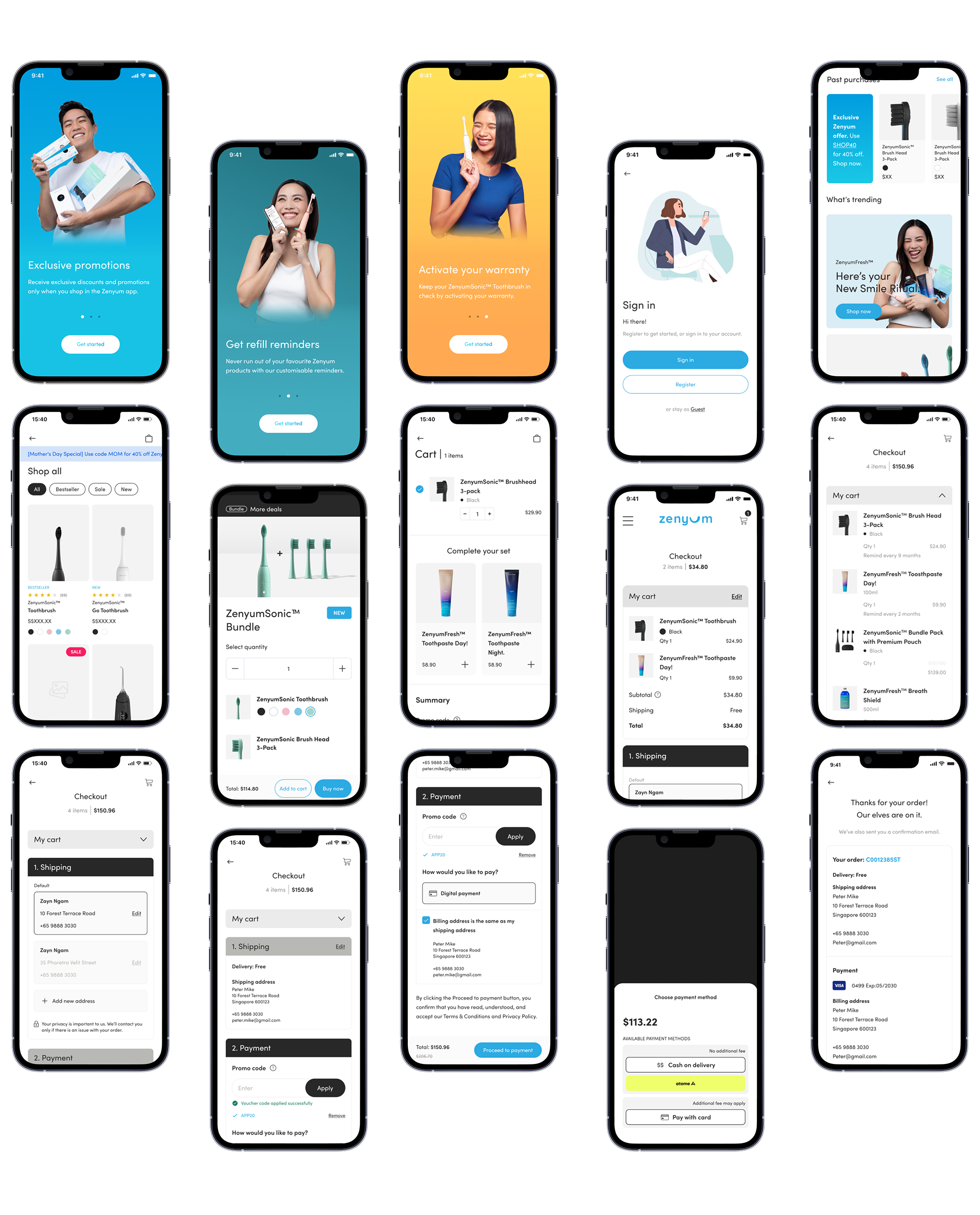
After shortlisting the priorities, the team landed on the following Epics for the first release: Home, Navigation, Category Story, Product listings, Check-out, User Profile, Footer, and On-boarding form for lead collection. These Epics were further broken down into smaller user stories that were prioritized based on their impact on user experience and business goals.
Bringing the Approach, Brand, and Epics together
View live website here
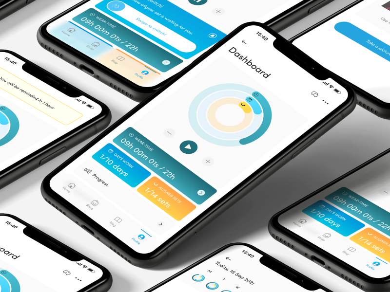
App Commerce
The app that makes oral care fun and easy! With personalized product recommendations, engaging educational content, and innovative features, Super Smile is your one-stop shop for a healthy, bright smile. Say goodbye to the hassle and confusion of oral care, and say hello to Super Smile!
—
" The website and app are user-friendly, I can sign up with ease and the checkout was seamless"
Verified Reviewer from Google
—
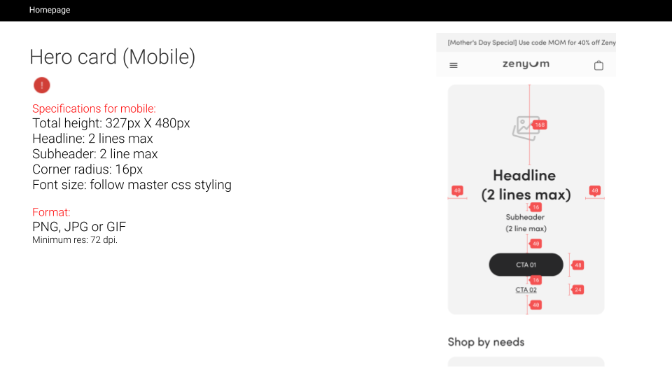
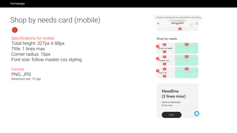
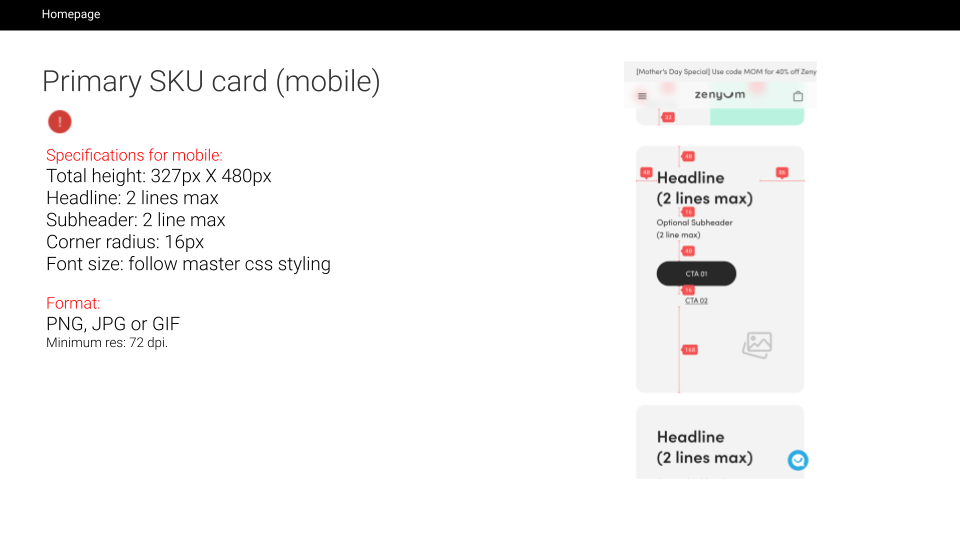
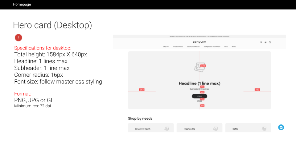
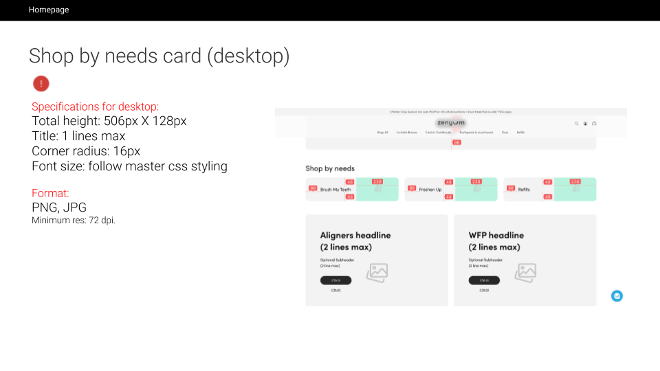
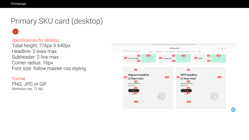
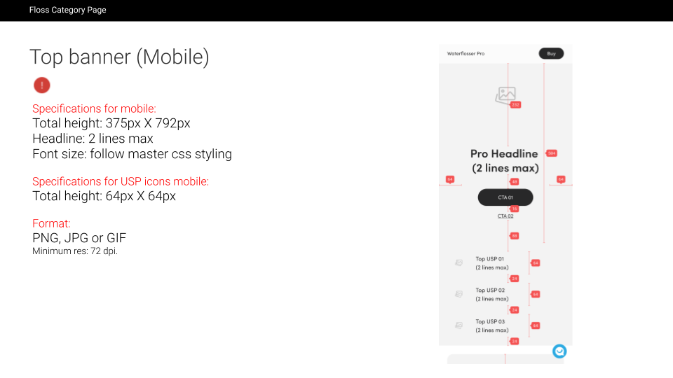
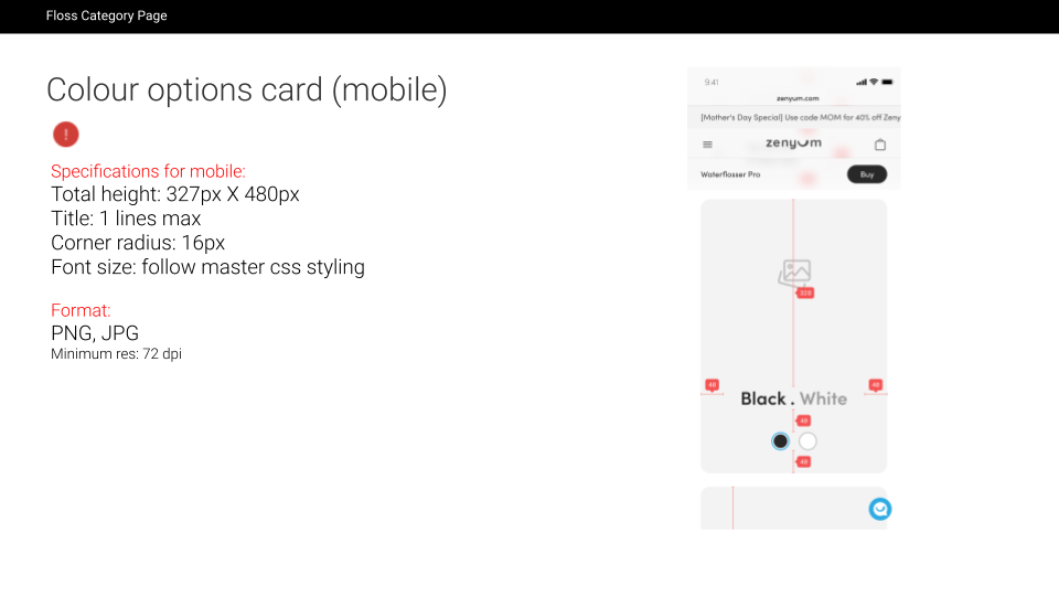
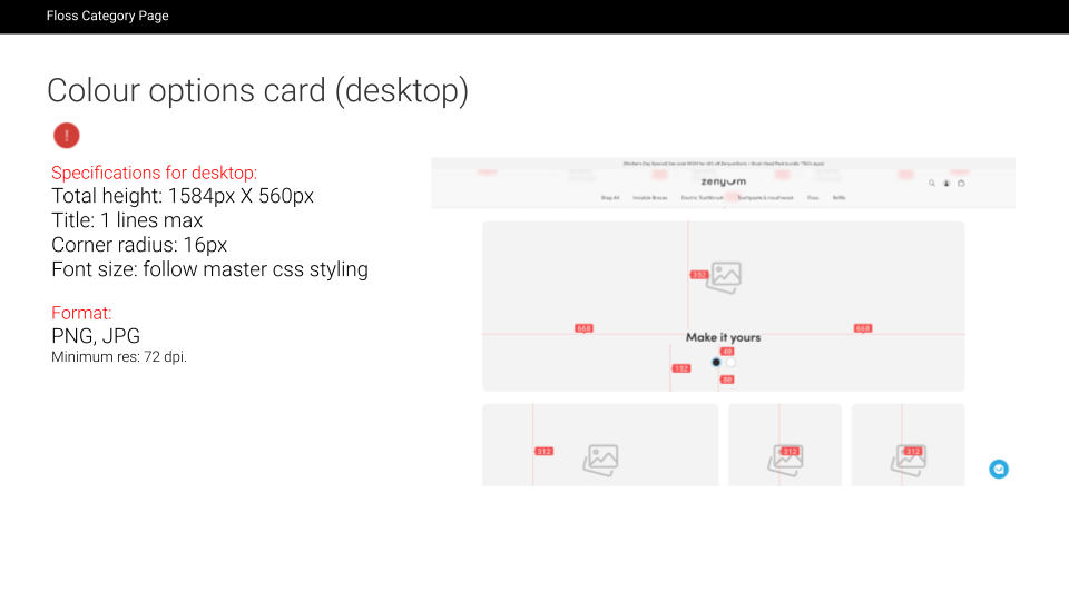
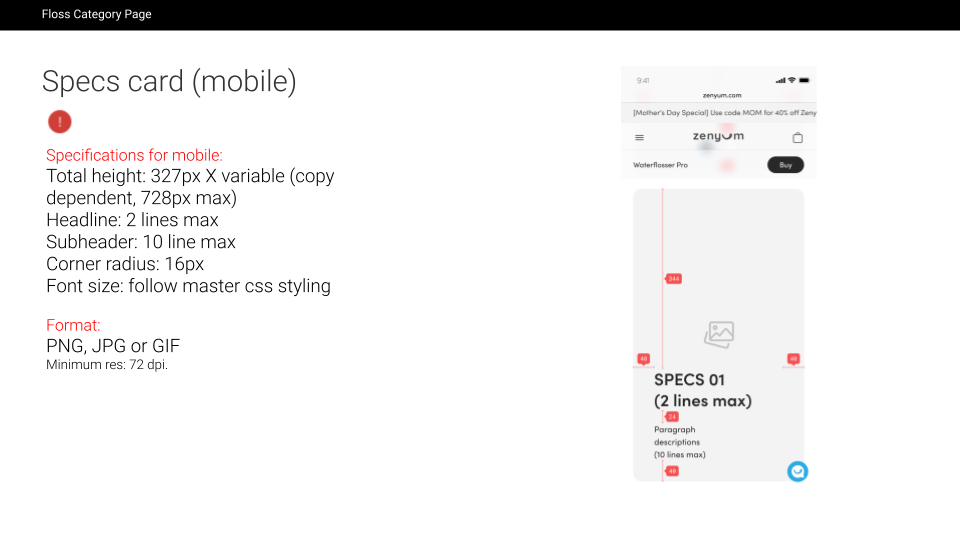
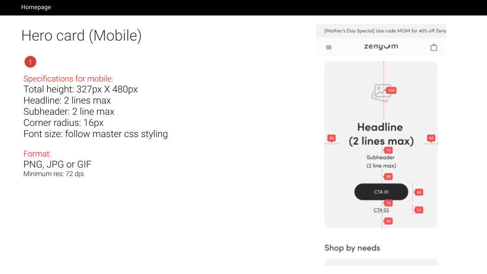
Design Atlas
Setting up design guidelines, specifications, and tools to streamline the work of getting from Figma to regional teams.

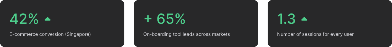
Metrics

Challenges and Compromises
Facing a tight three-month deadline for product launch, the UX/UI team must strategically prioritize design tasks that best align with both business objectives and user needs. Despite the challenges of a small team and time constraints, which could affect the quality of the design, the focus remains on impactful design choices. Issues like limited resources and the absence of established processes, while significant, are deemed secondary and manageable through thoughtful planning and prioritization.